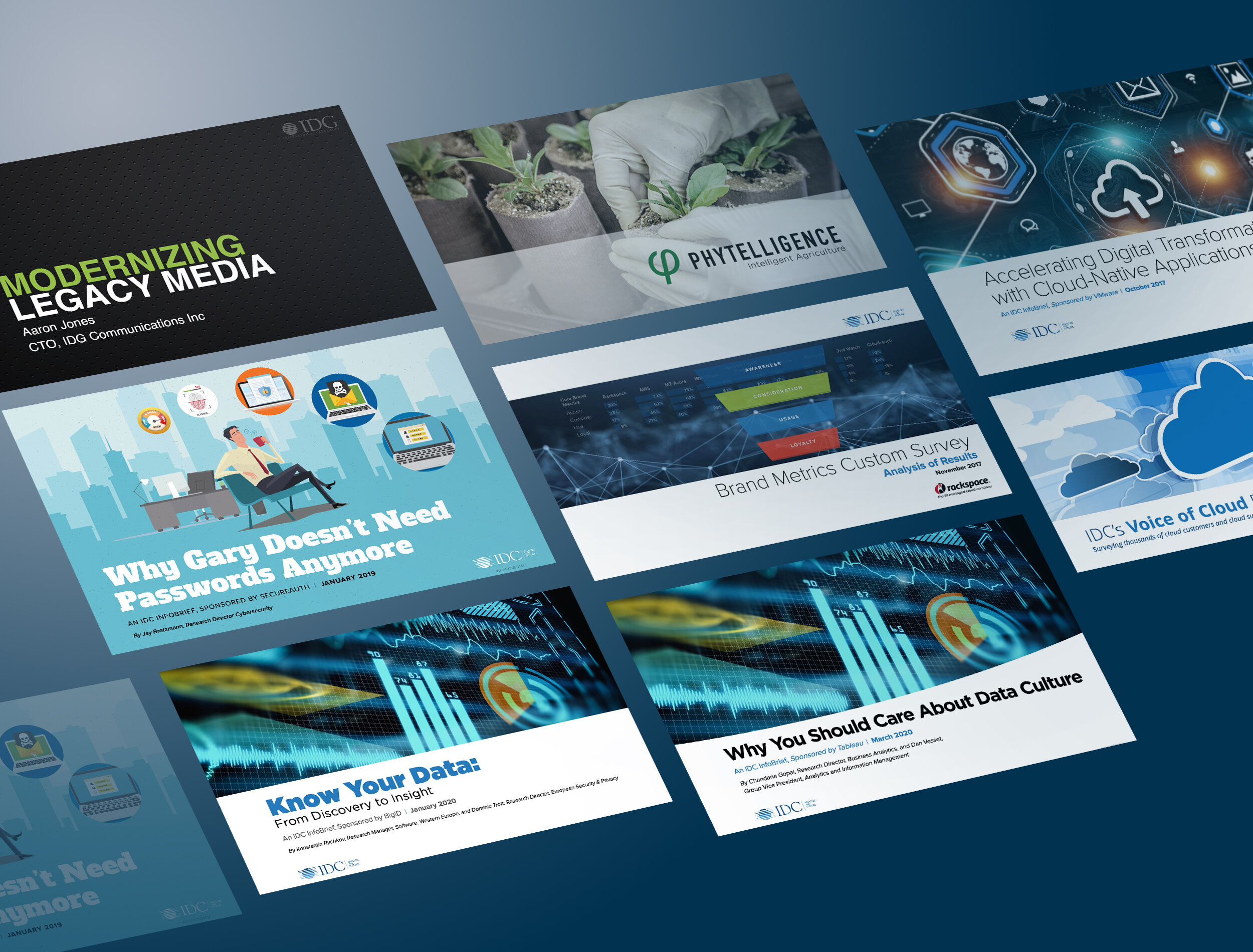
PRESENTATION MEDIA
In 1984 a man named Robert Gaskins invented Powerpoint. Today, Microsoft (who now owns it since 1987) Powerpoint remains a leading software choice for professional, business, and casual computer users worldwide.
Used to create presentations for projects ranging from very simple single page documents that outline a product or service on up to larger full-scale projects that might encompass a full company demonstration or one of its larger projects or services.
Many folks use Powerpoint for fun things like party invites and slide shows. Or maybe just as an organization tool to put notes together... But still today, many individuals, businesses, and companies use presentation media to present content. In fact, now there are multiple software applications that help create slide documents and presentations. Apple’s Keynote, and even the page publishing application by Adobe—Indesign can very easily used as a slide document or presentation creation tool.
As far as Powerpoint goes in particular, it remains a very important tool to most businesses today and that's for several reasons:
It's easy to work with
It typically comes with most computer system packages so it's easily available
Works on both Macintosh and Windows platforms
Easy to email
Easy to share with others
Inexpensive design solution
One of the primary challenges with Powerpoint has been its lack of high end design ability. That is, it's ability to create top-notch, professional graphics to develop compelling presentations. What I personally see quite a bit are presentations rendered by some of the world's largest organizations, thrown together in a mishmash of poor images, photos, hard-to-read graphics, and slews of varying sized text that make what looks like a 2nd graders' informal book report. Junk thrown on a page. NOt to mention, usually illegally obtained online images (Google searched artwork)
A few samples of my presentation work
Click each sample below to open a few pages of each sample.


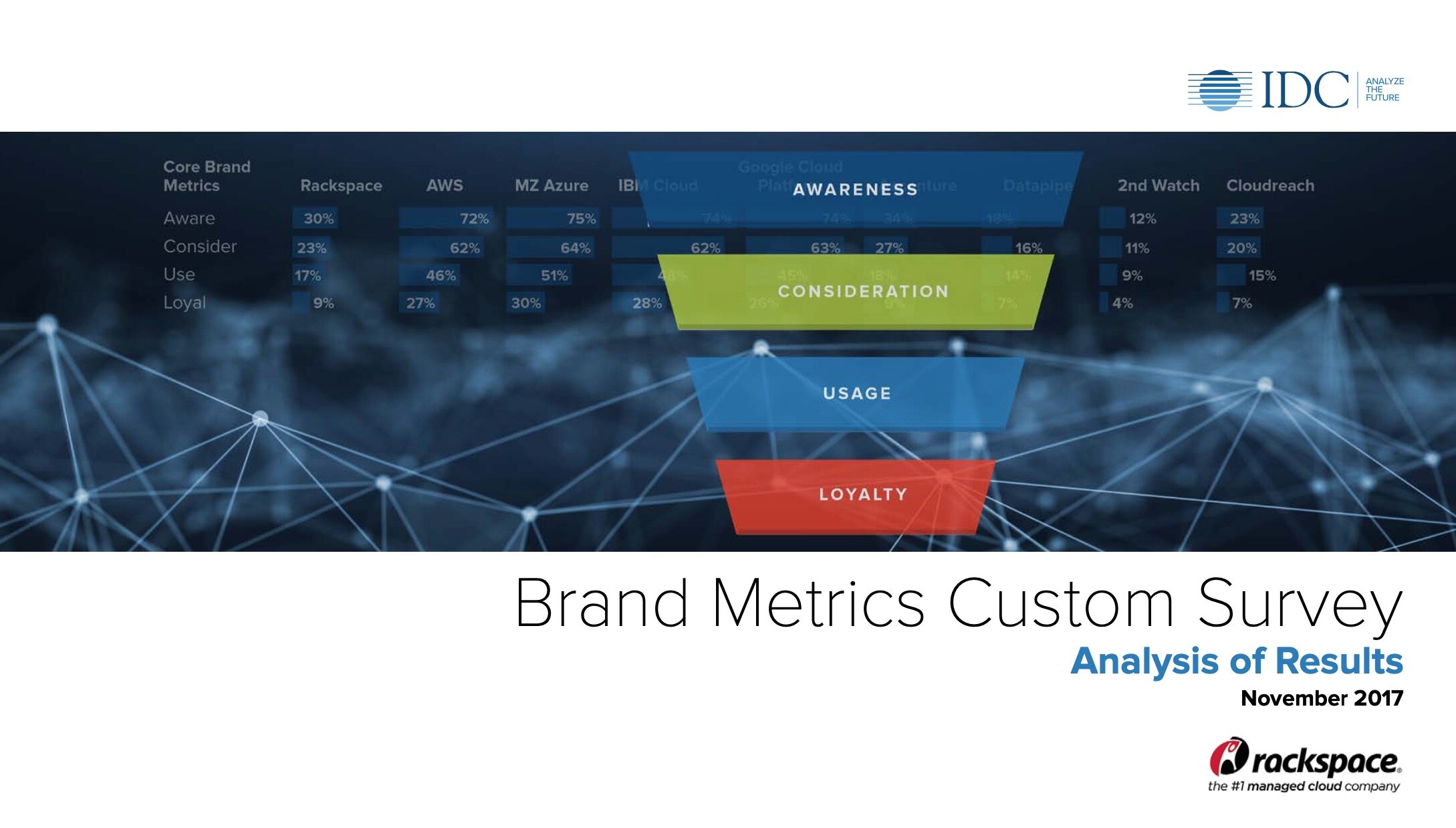




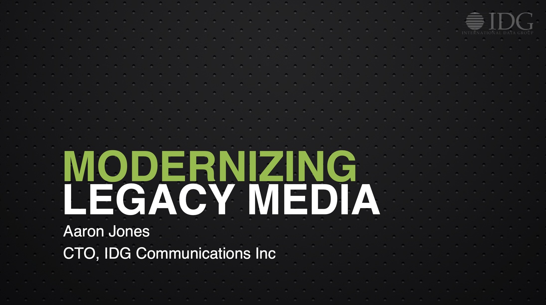
What's odd, is that these types of presentations are STILL widely used. And I'm talking about top professionals meeting with other top notch leaders and sharing some of this stuff. It looks terrible, is usually NOT brand-centric, and is illegally using copyrighted material. I see it often.
That’s not to say there aren’t good presentations out there— there are. But sadly the exception, not the rule. An it’s important to note here that no matter what is used, having it done my a creative professional hands down makes a huge difference. Knowing the right art, format, colors, graphics, and other key design aspects can make any project, but slide decks in particular—excellent. It’s just a tool… a visual data visualization method that’s easy to work with.
What's more (and this is important), is the ability to thoroughly push the software fully to use all of its available actions, graphic capabilities, and functionalities... This software can really sizzle. You just have to know what the program offers, and how to use them all. Match that with a good design eye - and voila, a magnificent presentation. So Powerpoint can be practical, widely accepted, and advantageous—if done well.
Here are the keys to creating awesome presentations and slide documents:
Think of 3 keys: Quality (how good it needs to be), Budget (what it’s worth investing), and Value (what it’s worth)
Use the best platform. Apple keynote, Microsoft Powerpoint, and Adobe Indesign (pdf) are all capable of generating them
What is best for your client—what they have and comfortable working with
If high end design is needed, Indesign—otherwise Apple keynote or Microsoft Powerpoint would work
Be sure to use high end designers to be sure you get the best outcome
Do NOT use stuff you find online— it’s illegal!
Use good quality, purposeful graphics— not just “anything”
Think of Powerpoint as a limited design tool— but a design tool that can be pushed
Think of the end— what the ideal outcome is, who it’s for, and the quality it needs to be
Easy to work on (do it your self) or designer-created
Ask, “do I REALLY want people to be able to work on and potentially mess up the slide deck?” or use another format they cannot (pdf)
If it’s simple, basic, and only to talk selling points to a basic team— Powerpoint might be ok
If you want to impress though— hire talent, and consider other alternatives
Simple, practical, and inspired creative solutions. Free consulting. Free advice. Free first project for qualifiers. Creative strategies and solutions—made easy.
Get creative. http://www.mitchellcreativegroup.com, todd@mitchellcreativegroup.com, (508)494-8182.
© Copyright Todd Mitchell, Mitchell Creative Group, LLC
