Creative Blog.
Huddled Masses Website Development. How great people inspire great work.
Developing the Huddled Masses website was both fun and challenging. They had a few variations of older site desigs, and variety of brand segments that we needed to bring together into a modern and practical presentation that really represented their CEO Kristie and the team, as well as make it “fun” for their clients to engage as well. The “game pieces” theme fit into their basically helping their clients find and fit that “missing piece.”
Working with some of the best PR talents (Laura Goldberg @https://www.lbgpr.com, and Susanna Hinds) made the project high caliber, high energy, and top shelf professional.
The team at Huddled Masses are wonderful to work with, and as performance marketers, absolutely the terrific. Great people, that all inspire teamwork and great work.
Meet Huddled Masses
Performance marketing solutions that drive real ROI.
Digital advertising campaigns can sometimes feel precarious. One element or piece out of place and everything collapses.
Huddled Masses has a track record in helping clients find that critical piece of the digital advertising puzzle to pull it all together. Oftentimes it’s a piece that they didn’t even know was missing.
Kristie MacDonald, CEO—brings more than 15 years of entertainment marketing and research experience to her leadership role at Huddled Masses.
Direct Digital Holdings Branding and Website Development—The Value of a Great Team
Having any design project start off with a fun, exciting, and enjoyable kickoff call is always a great sign. Mark Walker their CEO, and their PR firm (Laura Goldberg @https://www.lbgpr.com) are incredible.
Direct Digital Holdings Branding and Website Development
Having any design project start off with a fun, exciting, and enjoyable kickoff call is always a great sign. Mark Walker their CEO, and their PR firm (Laura Goldberg @https://www.lbgpr.com) are incredible. An engaging and driven conversation led to what became a very cool project. They know what they like and want, yet allowed the creative process to unfold. Developing the site included branding. A logo and site that captured an energetic “forward moving, colorful, and exciting vibe that makes it engaging, interesting, and simple. Responsive mobility was a must here also.
Meet Direct Digital Holdings
Direct Digital Holdings brings state-of-the-art supply-side and demand-side advertising platforms together under one umbrella company.
They deliver significant ROI for middle market advertisers.
They give advertisers of all sizes unparalleled reach within general market and multicultural media properties.
CEO and founder, Mark Walker brings nearly 20 years of experience in private equity, building relationships, and revenue generating operations for Fortune 500 corporations as well as start-ups.
https://directdigitalholdings.com
eDocuments. The chameleon of design.
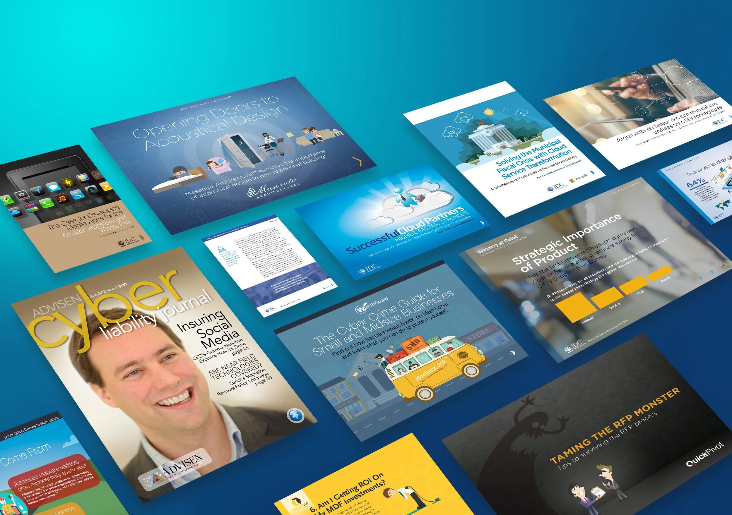
There’s no creative law that says “thou shall only create content the way it’s always been.” In the creative space, tapping into imagination and creativity means allowing exciting, fresh, and invigorating ideas to flow through and out. And that goes for everything— and in this case, ebooks and infographics.
I wanted to re-post a prior blog here by popular demand! To show you how one bit of content—one document can be conformed into MANY different types of eDocuments…
There’s no creative law that says “thou shall only create content the way it’s always been.” In the creative space, tapping into imagination and creativity means allowing exciting, fresh, and invigorating ideas to flow through and out. And that goes for everything— and in this case, ebooks and infographics.
An ebook (electronic book) is an on-screen document that can be as creatively intense— full of great content, awesome artwork, and exciting interactivity— or as simple as plain old text. An infographic is a ‘graphical representation’ of data or content, and can also be exciting, well-designed and fun, or as simple as can be. The goal should be to make the content easy to digest, fun to engage, and ultimately help throw your customers down the beautiful funnel directly to you!
The best part of imagination, at least for me, is that you can create anything. That is, after all, what creation is— right? And when it comes to ANY deliverable or creative project, there’s no reason to stick to the ‘norm.’ Imagine—create.
For ebooks, and infographics I make it a must that I always think creatively—making it sing, energize, and behave in a way that makes it super compelling and easy to understand. Fonts, color, graphics, layout, design, and then the myriad of options that allow us to add interactivity. We can create ePubs, embed video, other content, add pop-ups of data, sound, and much more!
So another great way to be creative is to pioneer and explore multiple options, which include ‘blending deliverables.’ In this case, introducing ebooks to infographics. And in many ways they really are the same. With an ebook, it’s content—usually longer text… but usually has some graphics throughout. With an infographic, its content—but more artistic, visually and graphically represented, and not so text heavy. So why not merge the two?
Check out the samples below. And remember, the options are almost infinite with creativity. And with the variety of unlimited design potential, art, and imagination—matched with technology… Anything is possible.
In the following examples, I started with an ebook— actually, an “InfoBrief” which is a variety of ebook—some text, some graphics. I created this InfoBrief for IDC originally with only that project in mind, and then using that as a model— converted it into several options to show you what “can” be done with any content. And illustrate the hybrid merging of ebook documents and infographics. How they can really work very nicely together.
InfoBrief
This example here below is of the original InfoBrief (ebook).
View InfoBrief, online as an “ePub” (electronic online view):
This ePub option allows more interactivity, embedding, social sharing, analytics, pdf download option, animation, and more… Same original InfoBrief, just in ePub format.
https://indd.adobe.com/view/18874d9b-7c72-4c19-8516-32e81d9abd40
Mobile Doc
The same InfoBrief, converted and created as a “mobile document.” A version that can be downloaded and viewed nicely on a mobile device.
View Mobile Doc as a pdf on browser (ideal to view on a mobile device):
Direct download Mobile Doc as an “ePub”— viewed on device ePub viewer (ideal to view on a mobile device):
InfoDoc (or eDoc)—
A much more graphical representation of an ebook or InfoBrief. Treating pages with more graphical “oomph”—color, art, layout. AND blending in the infographic components. I took pages of content and created “infographics” on a page, rather than flowing all the text.
The InfoDoc (or eDoc) is a hybrid ebook/infographic. Filling the gap between the two. As shown particularly on page 7— it combines prior ebook pages of content and merges that content into an info-graphical page…
Download and view “pdf” on your device:
Filling the eBook - InfoGraphic “gap”
Download and view “ePub” on your device:
Filling the eBook - InfoGraphic “gap”
Simple, practical, and inspired creative. Free creative coaching. Free first project for qualifiers. The best creative solution. 3.2.1. Get creative. http://www.mitchellcreativegroup.com, todd@mitchellcreativegroup.com, (508)494-8182.
© Copyright Todd Mitchell, Mitchell Creative Group, LLC
eBook vs. InfoGraphics— filling the “gap”
There’s no creative law that says “thou shall only create content the way it’s always been.” In the creative space, tapping into imagination and creativity means allowing exciting, fresh, and invigorating ideas to flow through and out. And that goes for everything— and in this case, ebooks and infographics.
There’s no creative law that says “thou shall only create content the way it’s always been.” In the creative space, tapping into imagination and creativity means allowing exciting, fresh, and invigorating ideas to flow through and out. And that goes for everything— and in this case, ebooks and infographics.
An ebook (electronic book) is an on-screen document that can be as creatively intense— full of great content, awesome artwork, and exciting interactivity— or as simple as plain old text. An infographic is a ‘graphical representation’ of data or content, and can also be exciting, well-designed and fun, or as simple as can be. The goal should be to make the content easy to digest, fun to engage, and ultimately help throw your customers down the beautiful funnel directly to you!
The best part of imagination, at least for me, is that you can create anything. That is, after all, what creation is— right? And when it comes to ANY deliverable or creative project, there’s no reason to stick to the ‘norm.’ Imagine—create.
For ebooks, and infographics I make it a must that I always think creatively—making it sing, energize, and behave in a way that makes it super compelling and easy to understand. Fonts, color, graphics, layout, design, and then the myriad of options that allow us to add interactivity. We can create ePubs, embed video, other content, add pop-ups of data, sound, and much more!
So another great way to be creative is to pioneer and explore multiple options, which include ‘blending deliverables.’ In this case, introducing ebooks to infographics. And in many ways they really are the same. With an ebook, it’s content—usually longer text… but usually has some graphics throughout. With an infographic, its content—but more artistic, visually and graphically represented, and not so text heavy. So why not merge the two?
Check out the samples below. And remember, the options are almost infinite with creativity. And with the variety of unlimited design potential, art, and imagination—matched with technology… Anything is possible.
In the following examples, I started with an ebook— actually, an “InfoBrief” which is a variety of ebook—some text, some graphics. I created this InfoBrief for IDC originally with only that project in mind, and then using that as a model— converted it into several options to show you what “can” be done with any content. And illustrate the hybrid merging of ebook documents and infographics. How they can really work very nicely together.
InfoBrief
This example here below is of the original InfoBrief (ebook).
View InfoBrief, online as an “ePub” (electronic online view):
This ePub option allows more interactivity, embedding, social sharing, analytics, pdf download option, animation, and more… Same original InfoBrief, just in ePub format.
https://indd.adobe.com/view/18874d9b-7c72-4c19-8516-32e81d9abd40
Mobile Doc
The same InfoBrief, converted and created as a “mobile document.” A version that can be downloaded and viewed nicely on a mobile device.
View Mobile Doc as a pdf on browser (ideal to view on a mobile device):
Direct download Mobile Doc as an “ePub”— viewed on device ePub viewer (ideal to view on a mobile device):
InfoDoc (or eDoc)—
A much more graphical representation of an ebook or InfoBrief. Treating pages with more graphical “oomph”—color, art, layout. AND blending in the infographic components. I took pages of content and created “infographics” on a page, rather than flowing all the text.
The InfoDoc (or eDoc) is a hybrid ebook/infographic. Filling the gap between the two. As shown particularly on page 7— it combines prior ebook pages of content and merges that content into an info-graphical page…
Download and view “pdf” on your device:
Filling the eBook - InfoGraphic “gap”
Download and view “ePub” on your device:
Filling the eBook - InfoGraphic “gap”
Simple, practical, and inspired creative. Free creative coaching. Free first project for qualifiers. The best creative solution. 3.2.1. Get creative. http://www.mitchellcreativegroup.com, todd@mitchellcreativegroup.com, (508)494-8182.
© Copyright Todd Mitchell, Mitchell Creative Group, LLC


